by Roe Pressley
DocuCopies.com
Key Takeaways
- Choose colors intentionally. Your color palette shapes first impressions before a single word is read.
- Match colors to the emotions you want to trigger. Use red for urgency, blue for trust, green for health, and yellow for optimism.
- Learn the color wheel. Understanding primary, secondary, and tertiary colors helps you make more informed and intentional design decisions.
- Use color harmonies — complementary, analogous, triadic, or monochromatic — to ensure your palette works together cohesively.
- Apply the 60-30-10 rule (60% dominant, 30% secondary, 10% accent) to create visual balance and guide the reader's eye.
- Use free tools like Canva, Adobe Color, and Coolors to build and test your palette before going to print.
- Design in CMYK and proof at actual print size before committing to a full production run.
Color is one of the most important decisions in print marketing and branding. Before viewers look at your products, services, or pricing, they're already evaluating your print collateral and your business based on the color scheme (even if only subconsciously). The colors you choose for affects how your print materials are perceived, how your brand is remembered, and whether a customer takes action.
"How do I choose the right colors for my marketing materials?"
This guide explains how color theory and psychology influence purchasing behavior, and how you can apply these principles to create effective printed materials for your business.
Why Color Matters in Print Marketing
Color is often the first thing people notice about a printed piece. It helps establish visual hierarchy, communicates brand identity, and guides attention toward key elements.
This isn't just theoretical. Research shows that color plays a significant role in how consumers evaluate products and marketing materials. Studies have found that color can account for up to 90% of initial product judgments and significantly impact brand recognition and purchasing decisions.
- Color has a significant influence on first impressions.
- Consistent color usage improves brand recognition.
- High contrast improves readability and engagement.
Simply put, color influences how customers feel about your brand before they read a single word. This makes it one of the most important factors in print design, especially when attention is limited.
Color Psychology and Buying Behavior
Color psychology refers to how colors influence emotions and decision-making. While responses vary by audience, several general patterns are widely observed:
- Red: urgency, excitement, sales
- Blue: trust, reliability
- Green: health, sustainability
- Yellow: attention, optimism
Some of the data is staggering: according to research from Adobe, 1 in 2 consumers have chosen one brand over another based on its color scheme alone.
Color perception is influenced by context, culture, and audience expectations. The most effective color choices are those that align with both the message and the target audience.
For further reading:
Color Harmonies and Combinations
Effective color use isn't just about individual colors. It's about how colors work together to enhance the overall visual appeal.
Combining colors correctly improves readability and creates a more professional appearance in print materials. Many artists use a color wheel as a point of reference to combine colors for effective harmony.
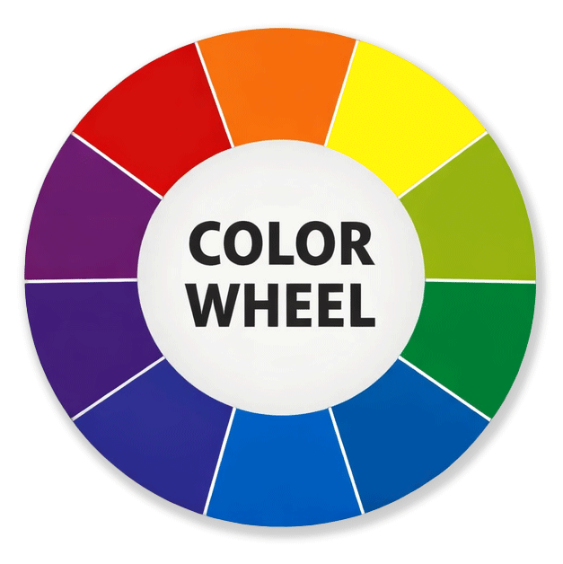
What is a Color Wheel?
The color wheel is a visual tool that shows the relationship between colors. It's used to understand and create color harmonies in design by illustrating how colors interact.
How to Use a Color Wheel
To use a color wheel effectively, it helps to understand the three basic categories of color.
- Primary colors:
These are the foundation of all other colors. You can't create them by mixing anything else. In traditional color theory, the primary colors are red, yellow, and blue. Since humans are trichromatic, meaning we see color through three types of receptors, this system lines up with how we experience the full color spectrum. - Secondary colors:
These are made by mixing two primary colors in equal parts. On the color wheel, they sit between the primary colors. Red and yellow make orange, red and blue make purple, and blue and yellow make green. - Tertiary colors:
These come from mixing a primary color with a nearby secondary color. They're sometimes called intermediate colors because they sit between primary and secondary colors on the wheel. Examples include blue-green, blue-violet, red-orange, red-violet, yellow-orange, and yellow-green.
One important note: most design software defaults to RGB, but printing uses CMYK. That's why colors can shift when something looks right on screen but prints differently.
To avoid surprises, check out our guide on RGB vs. CMYK color profiles. As a general rule, always design for print in CMYK.
Key Harmonies:
- Complementary: Opposite colors on the wheel (e.g., red and green).
Produces strong contrast and high visibility. - Analogous: Adjacent colors (e.g., blue, blue-green, green).
Produces a smooth and cohesive appearance. - Triadic: Three evenly spaced colors (e.g., red, yellow, blue).
Produces a balanced contrast and variety. - Monochromatic: Variations of a single color (e.g., light blue, dark blue).
Produces a clean and consistent appearance.
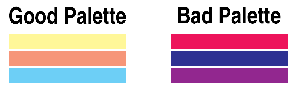
This example shows how not all color palettes create the same visual experience. Even when two palettes use three colors, one can feel balanced and approachable while the other feels loud, harsh, or harder to work with in a print design.
The palette on the left works better because the colors feel softer and more coordinated. The light yellow, muted peach, and calm blue create contrast without competing for attention. Together, they feel more balanced, easier on the eyes, and more flexible for marketing materials where readability and overall presentation matter.
The palette on the right is less effective because each color is highly saturated and visually intense. The bright pink, deep blue, and strong purple all demand attention at the same time, which creates tension instead of hierarchy. Rather than guiding the viewer through the design, the colors compete with one another and can make the overall piece feel overwhelming.
In simple terms, the left palette feels more harmonious, while the right palette feels more aggressive. That does not mean bold colors are always wrong, but in most print marketing designs, a palette works best when the colors support each other instead of fighting for attention.
How to Choose Colors for Print Marketing Materials
Your process for choosing colors should take a structured and intentional approach. Don't rely on guesswork.
- Define the goal of your design and desired customer action, such as signing up, purchasing, or attending.
- Choose a dominant color that supports your message.
- Use a secondary color to support layout and balance.
- Add an accent color for calls to action.
- Maintain strong contrast for readability.
A common approach is the 60-30-10 rule, which helps create visual balance and hierarchy. This principle says that 60% should contain the dominant color (such as the background), while the secondary color (such as written content) should make up 30%, with the remaining 10% used for your accented content.
Always design with print in mind by using CMYK color values and reviewing proofs before large production runs.
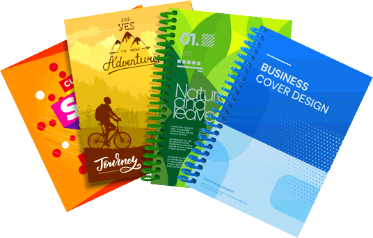
Design Tips for Postcards, Posters, and Book Covers
While we're using just three common print products as examples, the same core color principles apply equally to most other print marketing material.
- Use bold contrast for headlines and calls to action.
This makes the most important information jump out and reinforces hierarchy. - Limit your palette to maintain clarity.
Too many colors is a visual distraction. Sticking to the 60-30-10 rule is considered best practice for most printed designs. - Use color to guide the reader's eye through the layout.
- Match color style to the audience and industry.
Examples:

- Test readability at actual print size.
Printing a rough draft on your office or home printer is typically sufficient.


Free Design Tools and Resources
Put your wallet away! You don't need to spend the big bucks to design effective content for print marketing. There are several free tools available for designers working on a budget.
Please note: DocuCopies.com is not affiliated with any of these services and these are intended as examples, not endorsements.
These tools can help you generate color palettes, build layouts, and produce print-ready designs.
With the information contained in this guide, we're confident you have the tools and knowledge to start designing a color-conscious design that gives you a measurable and impressive ROI.
Frequently Asked Questions
What colors work best for print marketing materials?
The best colors depend on your message and audience. Red works well for urgency and sales, blue for trust and professionalism, green for health and sustainability, and yellow for optimism and attention.
Rather than picking a single "best" color, focus on choosing a palette that aligns with your brand and the action you want customers to take. The 60-30-10 rule — 60% dominant, 30% secondary, 10% accent — is a reliable starting framework for most print designs.
What is the 60-30-10 rule in design?
The 60-30-10 rule is a color proportion guideline used to create visual balance in a design. It assigns 60% of the design space to a dominant color (typically the background), 30% to a secondary color (typically body content or layout elements), and 10% to an accent color used for calls to action and key highlights.
Following this rule keeps designs from feeling chaotic or visually overwhelming — and makes it easier to guide the reader's eye toward the most important information on the page.
What is color psychology in marketing?
Color psychology is the study of how colors influence human emotions and behavior. In marketing, it refers to how the colors in your materials shape a customer's perception of your brand, affect their mood, and influence their likelihood to take action — often before they consciously process any written content.
For example, fast food brands frequently use red and yellow because these colors are associated with urgency, appetite, and energy. Understanding these associations helps you make more intentional color decisions for your print materials.
Should I design print materials in RGB or CMYK?
Always design for print using CMYK color values. Most design software defaults to RGB, which is optimized for screens — but printers reproduce color using the CMYK (Cyan, Magenta, Yellow, Black) model. Designing in RGB and converting at the end can result in unexpected color shifts in the final printed piece.
Setting your document to CMYK from the start ensures that what you see on screen more closely matches what comes off the press. For more detail, see our guide on RGB vs. CMYK color profiles.
What are color harmonies and why do they matter?
Color harmonies are combinations of colors that work well together based on their relationship on the color wheel. The four most common are complementary (opposite colors for strong contrast), analogous (adjacent colors for a cohesive look), triadic (three evenly spaced colors for variety), and monochromatic (variations of a single color for a clean, consistent feel).
Using a recognized harmony makes your design feel intentional and professional rather than arbitrary, and improves overall readability in print.
What free tools can I use to choose colors for print marketing?
Several free tools can help you build and test color palettes before going to print. Coolors is great for generating and locking in palette combinations quickly. Adobe Color lets you explore harmonies using a live color wheel. Canva and Figma both offer full layout design with built-in color tools.
Please note: DocuCopies.com is not affiliated with any of these services and these are intended as examples, not endorsements.
Additional Resources and Related Pages
How to prepare print-ready files with correct bleeds, margins, resolution, and color profiles.
A beginner's guide to visual hierarchy, contrast, alignment, and other core design principles.
Print marketing ideas and strategies tailored for small businesses on a budget.
The difference between rich black and 100% K in CMYK printing, and when to use each.
Learn how to design bleeds, where print content extends to the edges of the finished piece.
Learn about different types of paper stocks used in professional printing environments.
 Processing...